01
Atmosphere
The first impression had to carry calm maritime depth without becoming a yacht cliché.
Premium Phinisi Website
A premium phinisi website translating Serenity’s brand system into atmosphere, onboard experience, destination clarity, and inquiry flow.
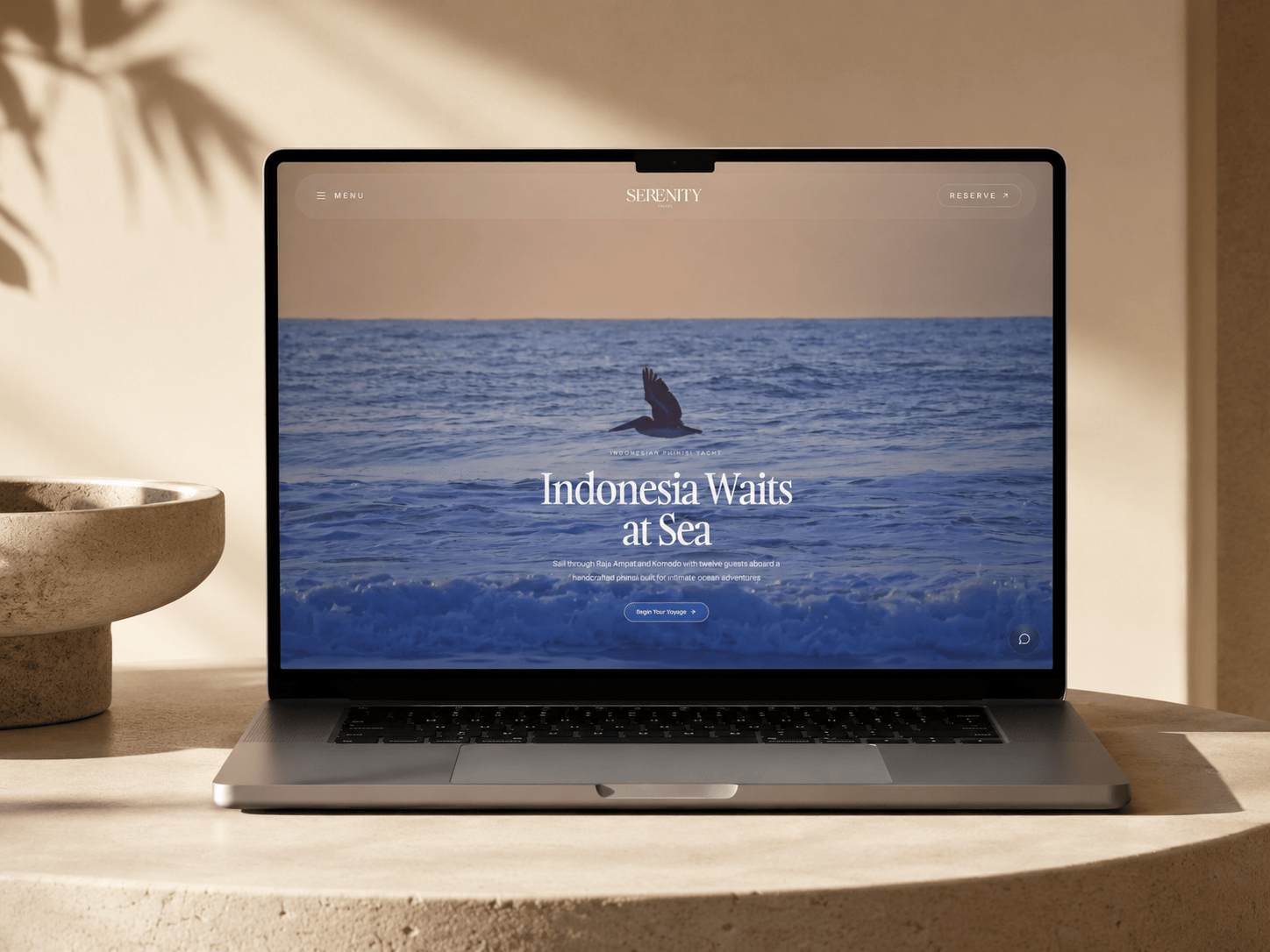
Primary website surface shaped around Serenity’s onboard atmosphere and maritime brand system.
01
Brand direction
Serenity’s direction centered on freedom, exploration, connection, contemporary heritage, and effortless luxury. The website needed to translate that into a calm digital surface with clear onboard, destination, and inquiry paths.
Freedom
Exploration
Connection
Contemporary Heritage
Effortless Luxury
02
Experience system
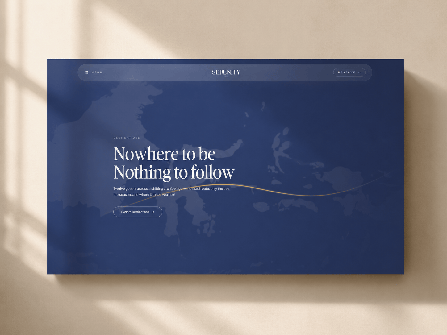
A website system for atmosphere, heritage, destination, and contact.
01
The first impression had to carry calm maritime depth without becoming a yacht cliché.
02
Deck, cabin, lounge, and sea rhythm had to support the feeling of staying aboard.
03
The phinisi identity and Sumba Ikat reference had to inform the interface quietly.
04
The website still needed a clear movement toward contact and voyage planning.
03
Visual proof
The page translates Serenity’s brand book into a website surface: maritime mood, onboard spaces, cultural detail, and a practical route toward contact.
01
Onboard atmosphere
Deck, sail shade, loungers, bar, and open sea carried the feeling of life aboard.

02
Heritage detail
The Sumba Ikat direction informed a restrained detail layer so the website could feel rooted without becoming decorative.
03
Inquiry movement
Destination, onboard experience, and contact needed a simple path so the website stayed useful, not only atmospheric.
04
Production readiness
What made the brand translation usable as a website.
The production layer stayed focused on responsive frontend, brand-to-web consistency, content structure, and contact readiness.
01
Responsive implementation for a premium yacht website with image-led sections and editorial pacing.
02
Deck, destination, onboard, and contact content arranged to stay readable across screen sizes.
03
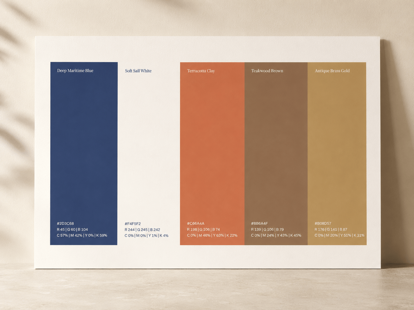
Palette, wordmark discipline, heritage detail, and calm spacing translated from the Serenity brand system.
04
Voyage interest, destination context, and inquiry movement kept visible without turning the site into a booking engine.
05
Record
A premium phinisi website that translated brand atmosphere into a clearer journey toward inquiry.
The project works as a brand-to-web record: maritime atmosphere, onboard comfort, contemporary heritage, responsive structure, and a direct path toward contact.